
DESIGN FOR FILM & TV
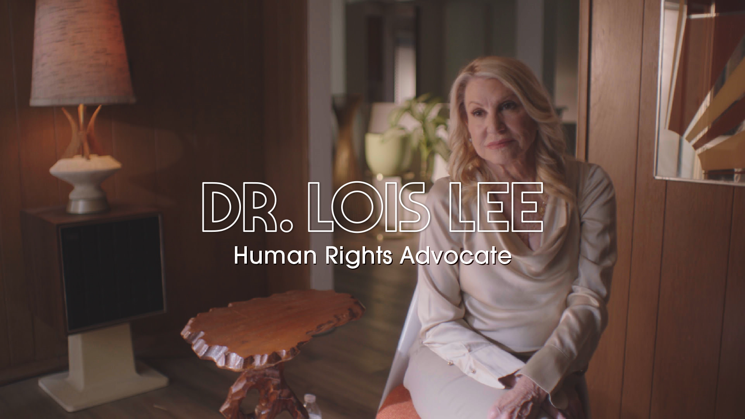
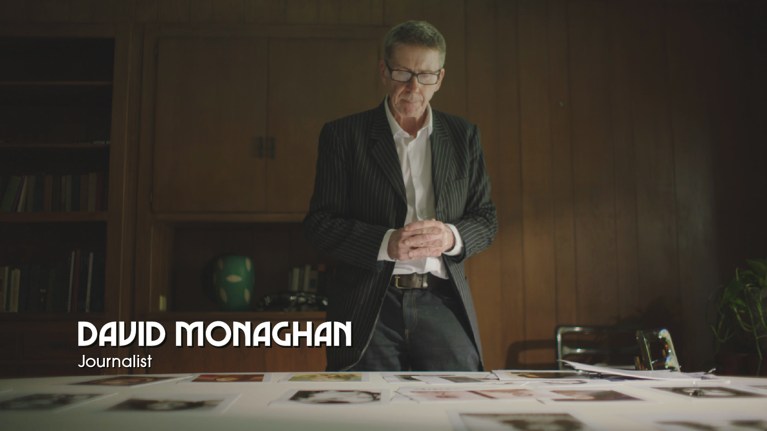
The Hillside Strangler
In 2025, I was hired to develop a system of titles, motion GFX, and maps for a gripping docuseries on MGM+. The director wanted to immerse viewers in the vibes of 1970s Los Angeles. So I started where I often do—with research.
TITLE DESIGN
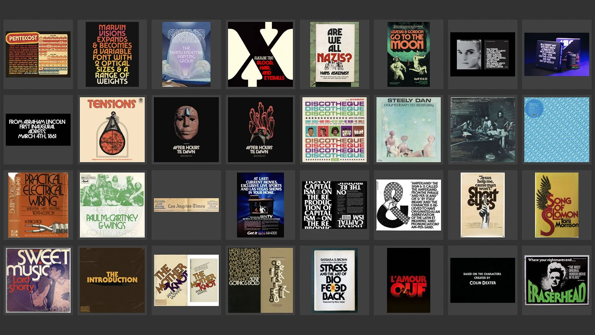
Fonts can establish setting as vividly as any costume or needle drop. Every letterform speaks to the styles and technologies of its era: bold, narrow capitals call to mind the wood-type posters of the nineteenth century, while delicate geometries recall the neon nights of the Roaring Twenties.
By the 1970s, phototypesetting and Letraset’s rub-on letters had given designers fast and affordable access to hundreds of new fonts, many of which sprung from the hand of Herb Lubalin and his colleagues at ITC. With hits like Avant Garde Gothic, Busorama, and Serif Gothic, those guys singlehandedly set the look of the decade’s typography.
Fifty years later, the ’70s are back in style. In 2019, Eliott Grunewald released Herbus, an homage to Lubalin’s “expressive geometry.” But it was Mathieu Triay’s vibey revival of the midcentury face Marvin that felt like the right fit for this series. As soon as I saw its slinky S, I envisioned a title sequence with the S and R stretching like the ends of a strangler’s rope:
Lubalin’s Avant Garde Gothic landed a supporting role for subtitles, slates, and lower thirds.
“Oliver was able to turn broad conversations about style into a bold, creative, and holistic suite of graphics that elevated our show. Easily the most invested and collaborative graphic artist I’ve ever worked with.”
MOTION GFX
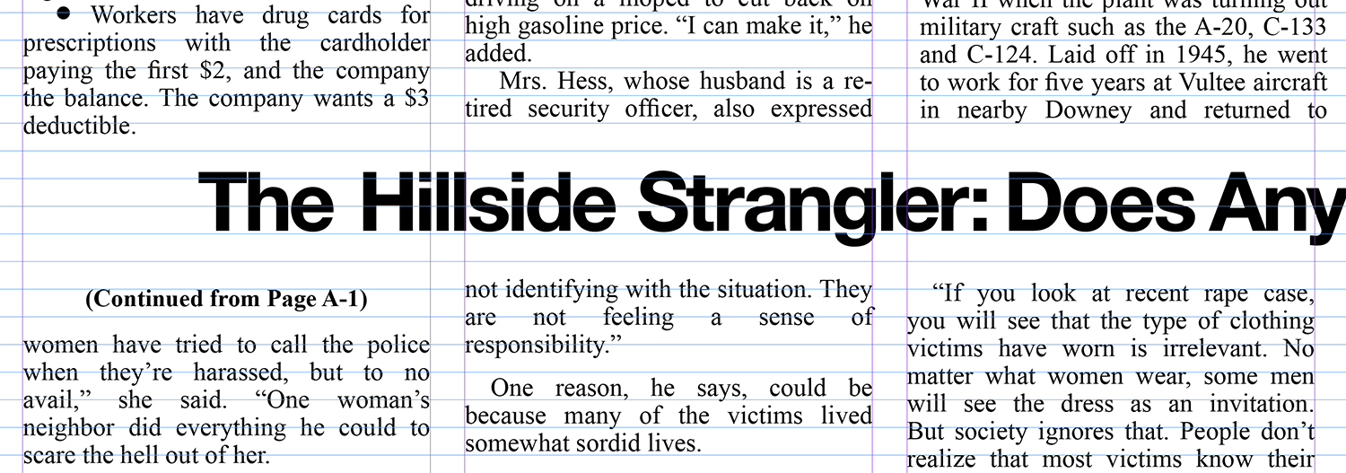
Telling this story required more than 100 newspaper clippings. To maintain a period aesthetic during these archival sequences, I animated the headlines to look as if you’re viewing them on a microfiche reader. Orthogonal pans and occasional rack focuses helped sell the illusion that you are investigating alongside the detectives.
When archival scans lacked the resolution for close-up shots, I rebuilt the newspaper pages from scratch. This required some serious sleuthing to identify the specific photoset typefaces used by each publication. After painstakingly retyping the articles (below) and creating new dot screens for the photos, I distressed the layouts to match the real scans.
MAPS
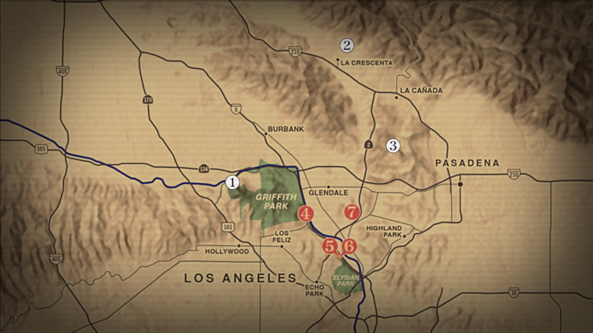
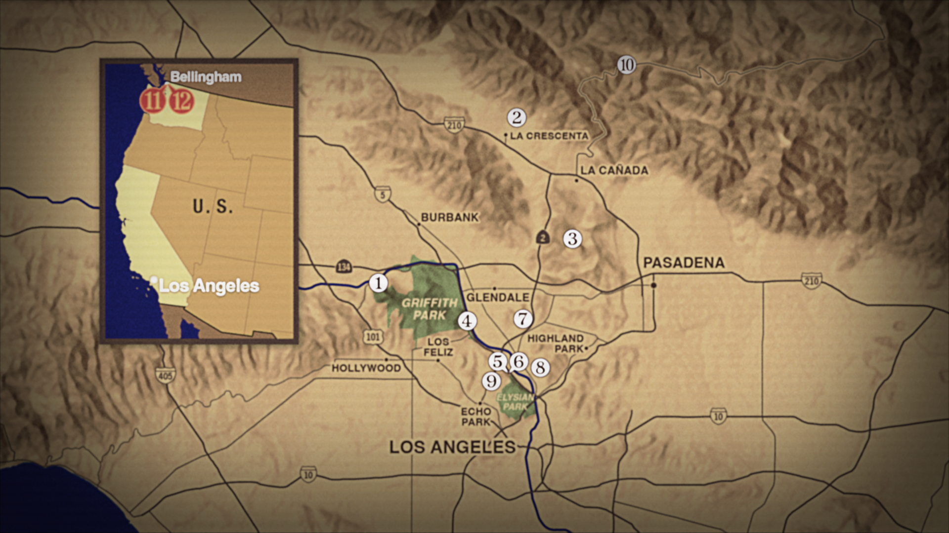
While not part of the initial graphics request, maps, I soon realized, could help viewers see how these murders terrorized the region. For weeks in late ’77 and early ’78, news broadcasts mapped where each new victim was found. From Griffith Park to Pasadena, there was no telling where a body would turn up next.
To keep viewers immersed in that terrifying time, I made my maps intentionally lo-fi with the glow, jitter, and interlacing of an analog broadcast. This approach extended to the nighttime alibi sequence in episode 102, for which I modeled the on-screen timer after the digital alarm clocks everyone had at their bedside back then.
“[Oliver] magically synthesizes your brainstorming sessions to produce a beautiful concept which, in hindsight, seems inevitable. ”